Here’s the challenge: we need to create an UI for all resolutions.
Canvas
What is a Canvas? You can imagine it as a component/object that contains all your UI elements and draws them.
When you create a new Canvas you can notice that Unity adds three components: a Rect Transform, a Graphic Raycaster and a Canvas Scaler. It also creates a new GameObject called EventSystem.
I won’t talk here about the Graphic Raycaster component and the EventSystem GameObject, let’s just say that they handle the overall input (e.g. clicking on buttons or mouse movement and dragging). You can discover more about them here: Event System Manager Documentation.
It’s important to know that Canvases render UI elements based on the hierarchy order (the first element is rendered first).
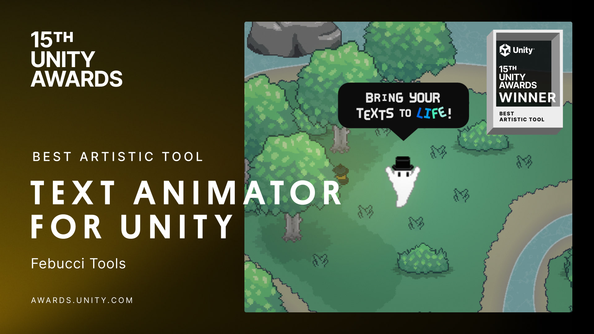
PS. Oh hey almost three years ago I released a plugin called “Text Animator for Unity”, a tool I made/needed for my own games - and Today it is also getting used in other games like “Dredge, Cult of The Lamb”, “Slime Rancher 2” and many more!! I’d love if you could check it out! you’d also support me while I work on exciting stuff behind the scenes, so… thank you very much! ✨
Baaack to the article.
Canvas Scaling
Now that we have our canvas, it’s important to make sure that it scales based on our resolution.
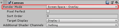
To do that, set the Render Mode to “Screen Space – Overlay“.
You can notice how the canvas changes if we change our resolution:
You can also set the Render Mode to “Screen Space – Camera” but be aware that it will fit the Camera Frustum this time.
Read more here: Canvas Documentation.
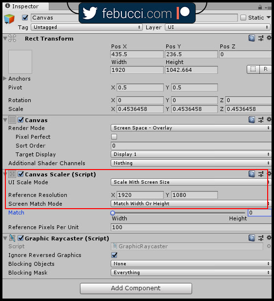
There are a few properties that we need to set in order to change the Canvas based on our screen 100%, set:
- “UI Scale Mode” to “Scale with Screen Size“
- “Reference resolution” (mine is 1920×1080)
- “Screen Match Mode” to “Match Width Or Height“.
- If the slider is near width, the canvas will match the width of your screen first.
Read more here: Canvas Scaler Documentation.
At this point we have a canvas that fits all resolutions proportionally based on our reference, now we need to resize and replace all our UI elements accordingly.
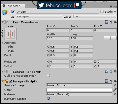
P.S. To show you about the Rect Transform component in the next part, I created an empty image.
Rect Transform
All UI elements have a Rect Transform component, which is the 2D counterpart of the Transform component. It represents an area that contains your UI element; you can scale it, rotate it and change its position.
Since it’s an area, you can also change the Width and the Height and you can modify its Pivot and its Anchors.
Pivot
The Pivot is the location where the rectangle/rect transform/area rotates around. It’s also the reference point for the position.
Anchors
Anchors are one of the most important thing in this tutorial, since they’re responsable of how your UI elements will change in proportion with the resolution.
The Unity documentation is also a bit hard for this one (at least for me, at the time I’m writing this post), so I’ll try to explain them in the easier way possible.
Since Rect Transforms represent a 2D Area, we need an anchor for each coordinate (X and Y)
Imagine them as “hooks“, they’ll hook their parent Rect Transform and will change based on it. If their parent changes, they will change and “follow him” depending on their values.
Each anchor is composed by a Minimum and a Maximum; the more range there is between and the more it will adjust.
For example, if Min is the same as the Max, the value will be constant, without scaling/adjusting.
If Min is 0 and Max is 1, the anchor will be hooked to it’s parent 100%.
If both axes/anchors have 0 as Min and 1 as Max, the Rect Transform will change in proportion 1:1 in all coordinates. This is useful for background images, since you want them to fit the entire screen.
Presets
Anchors have presets, you can see all the available ones and set them clicking the icon on the top-left here:
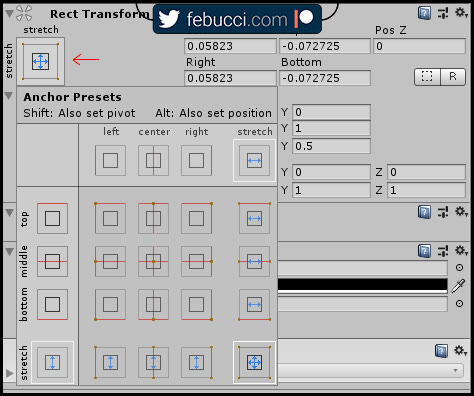
They already give you a clear idea of where and how your object will be “hooked/anchored”. The “Stretch” consist of the 0-1 range that we talked before, “red lines” are the one that will never change and persist between resolutions (so, Min = Max).
You can notice in which corner/side the anchor is placed; remember that it has its parent Rect Transform as a reference, so if you want to anchor an image called “A” to “B”, A needs to be a child of B in the hierarchy.
Read more here about the Rect Transform: Rect Transform Documentation.
Text
More than the stretch Rect Transform, you’d also need to scale the size of your text with different resolutions.
The “Best Fit” property of the Text component is what you’re looking for, you can set the “Min Font Size” and the “Max Font Size” and it will automatically fit the whole Rect Transform area (caring about those constant).
Read more here: Text Documentation.
I suggest to look at the Text Mesh Pro package, which replaces the Legacy Text UI and it’s available in Unity for free in the package manager.
You can use the “Best Fit” here too, it’s only called “Auto Size“.
Read more here: Text Mesh Pro Documentation (1.3)
Auto Layout
There are a lot of components that give you more control on the displacement of UI elements, other than Rect Transforms.
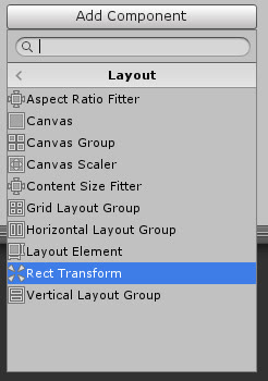
Layout Groups place their childs side by side, depending on how you set them. You can select the space between them, control their size and so on.
The “Horizontal Layout Group” component for example places its childs one next the other (along the X axis) and the “Vertical Layout Group” places them vertically.
The “Grid Layout Group” places them in a grid,? following the number of rows and columns that you provide.
Read more here: Horizontal Layout Group Documentation, Vertical Layout Group Documentation, Grid Layout Group Documentation.
The “Layout Element” component lets you override the size of your UI element (minimum, preferred or flexible). For example you can use it if you want an image to behave differently when placed inside a Layout Group.
Read more here: Layout Element Documentation.
Now that you know how Layout components work, you can start playing with our UI.
UI Example
I’ve made a simple UI example so you can download it and see how everything’s set.
It consists of three main sections:
- Middle Panel, where you have the game title and the main buttons. Its anchors are fixed on the middle of the screen.
- Right Panel, where you have some buttons. Its anchors are fixed on the right border of the screen.
- Bottom Panel, where you have other buttons. Its anchors are fixed on the bottom border of the screen.
Download my example unitypackage here.
In this tutorial I’ve used buttons and icons from https://kenney.nl/